Hong Kong City Rebrand - Rethinking the city’s Visual ID through the lens of Fusion & Motion.
TAGS

Hongkong is a fast-evolving megacity with a fusion of cultures from its English heritage.

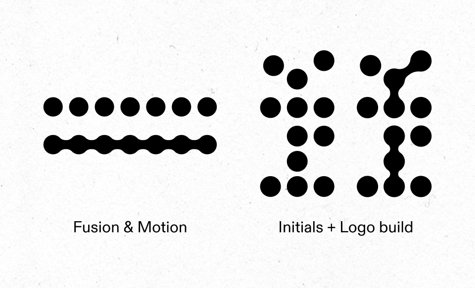
This visual identity leverages connecting dots as a visual metaphor for fusion, motion, and light.
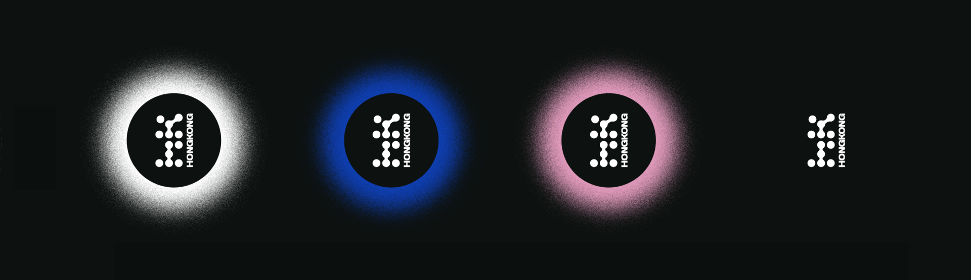
The logo features the City's initials formed by the dots and a strong Sans Serif typeface for a modern look.
This project develops the City’s Visual Identity along three axes: Main Brand, Public Policies & Culture.
Each of these have a unique color palette and tone, but are united through the use of the main brand pillars as tools of communication.
Each of these have a unique color palette and tone, but are united through the use of the main brand pillars as tools of communication.
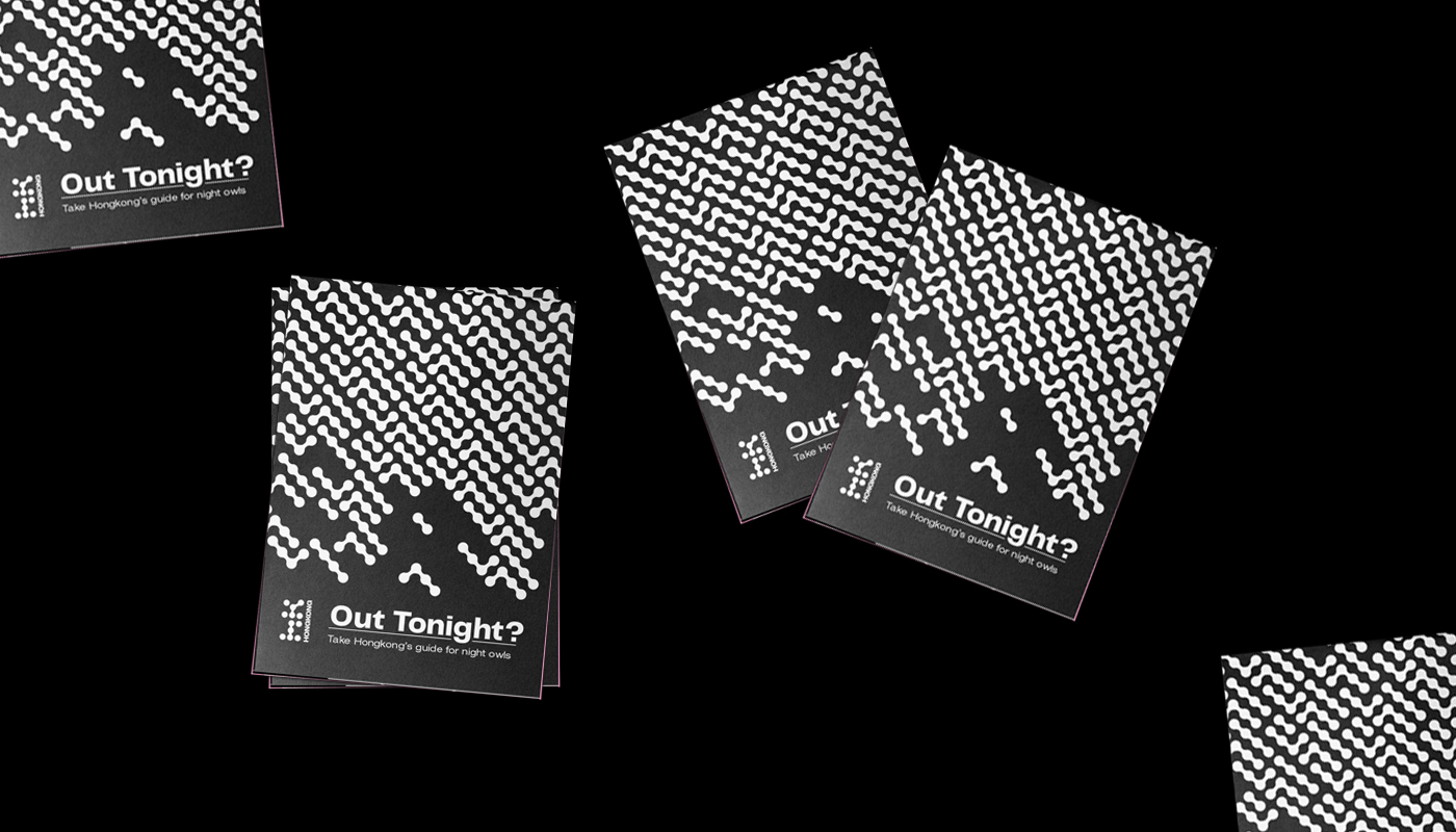
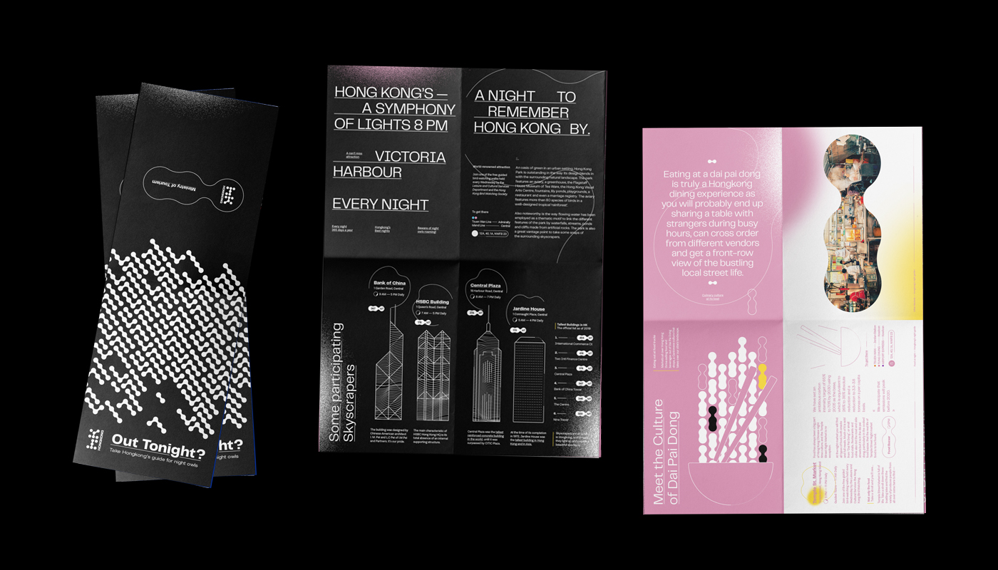
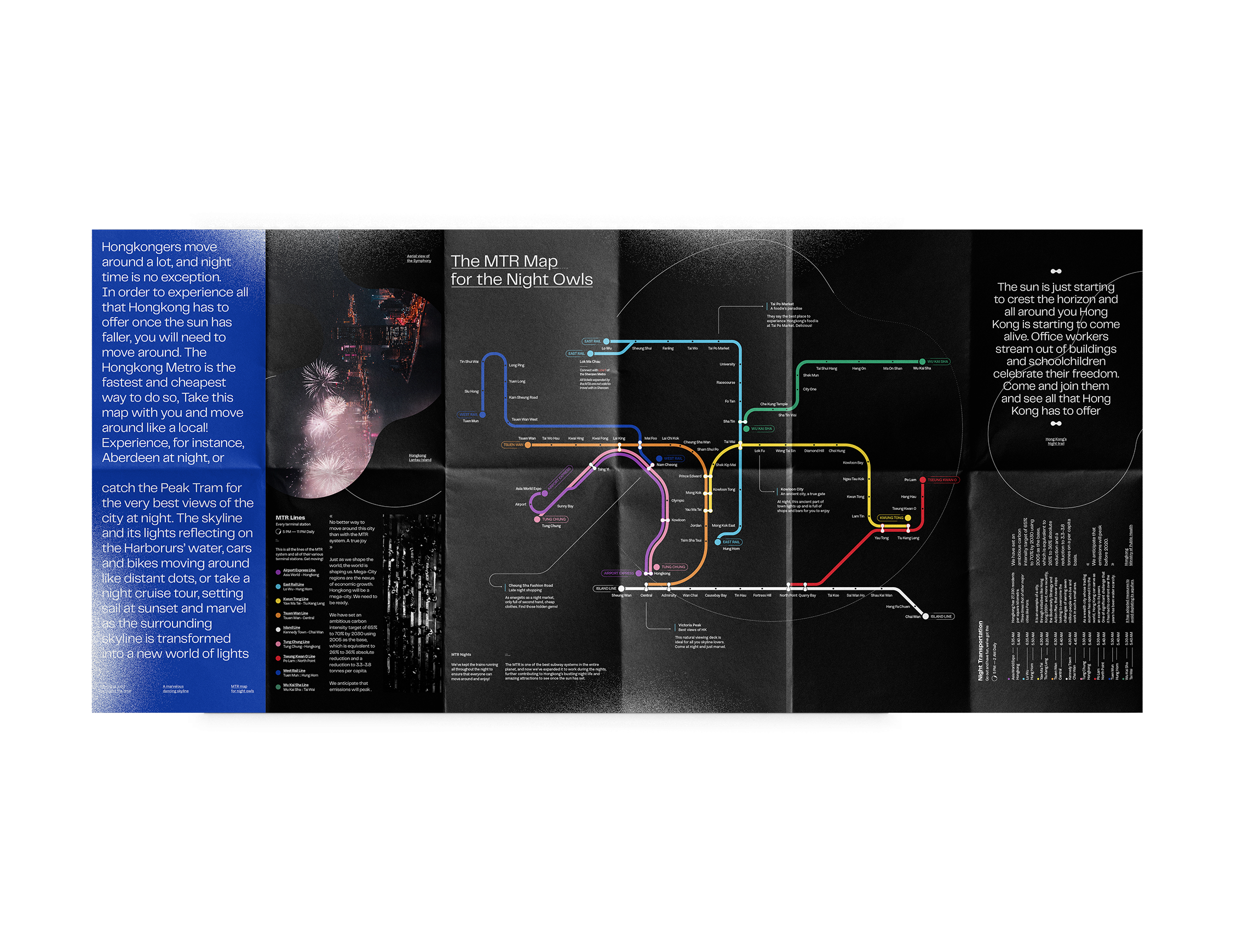
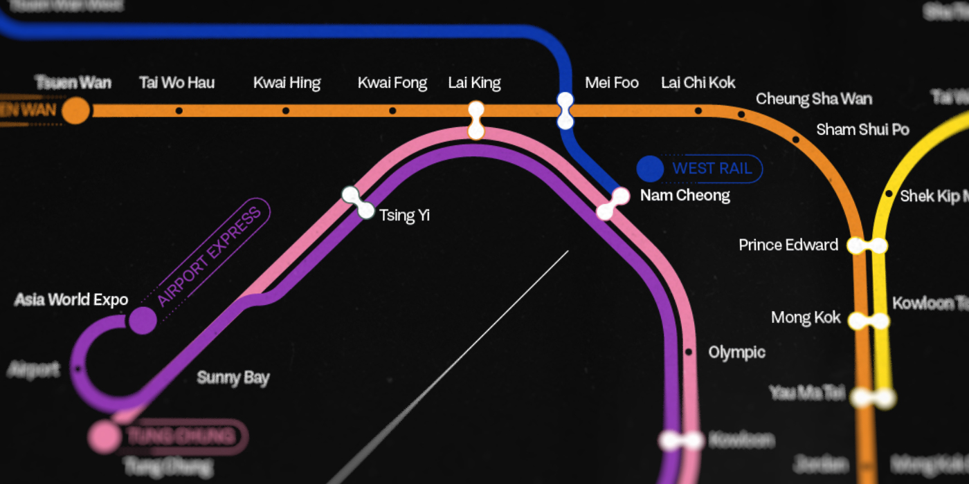
Hongkong is a city with a vibrant nightlife.
A brochure was made, highlighting the City’s activities and instructing turists and locals on how best to navegate the City at night.
This is the topic of the first axis.
A brochure was made, highlighting the City’s activities and instructing turists and locals on how best to navegate the City at night.
This is the topic of the first axis.

Hongkong has a very large problem with pollution. The City’s enhabitants have to live with bad air quality and smog daily. A campaign was created to highlight the City’s green areas and encourage people to live more sustainably.


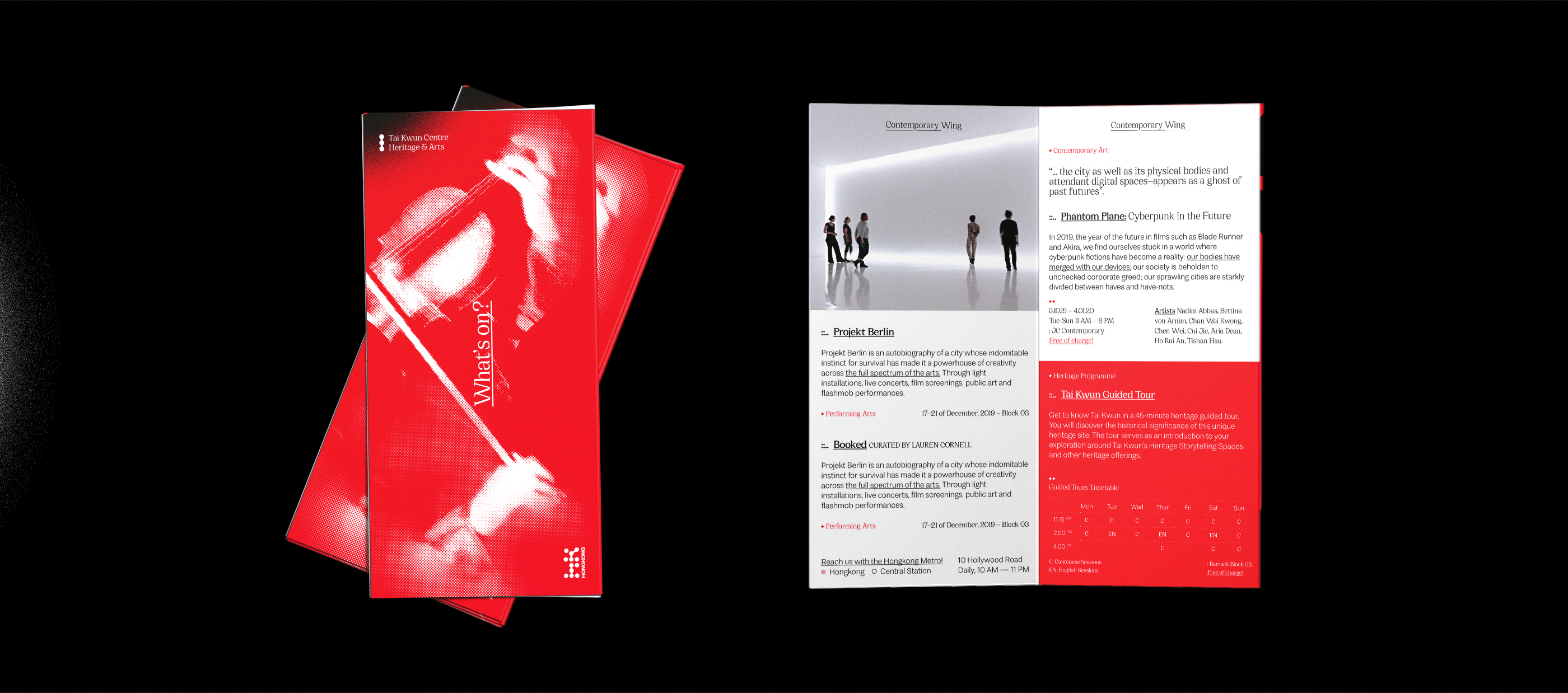
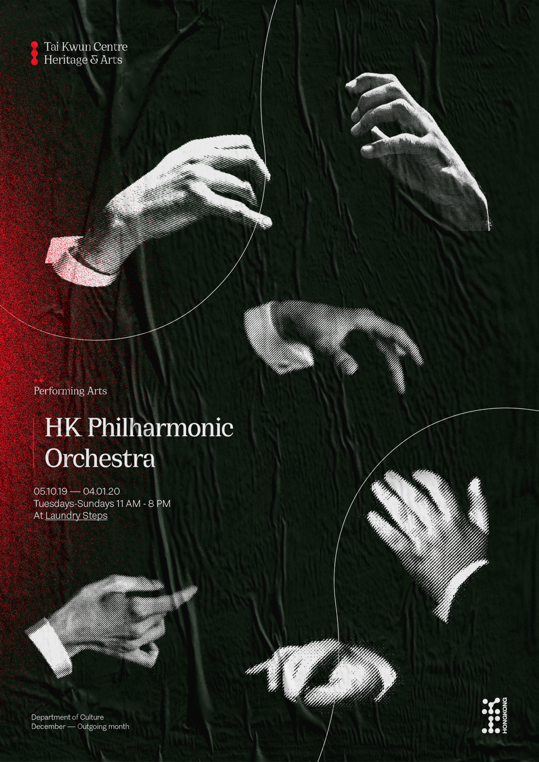
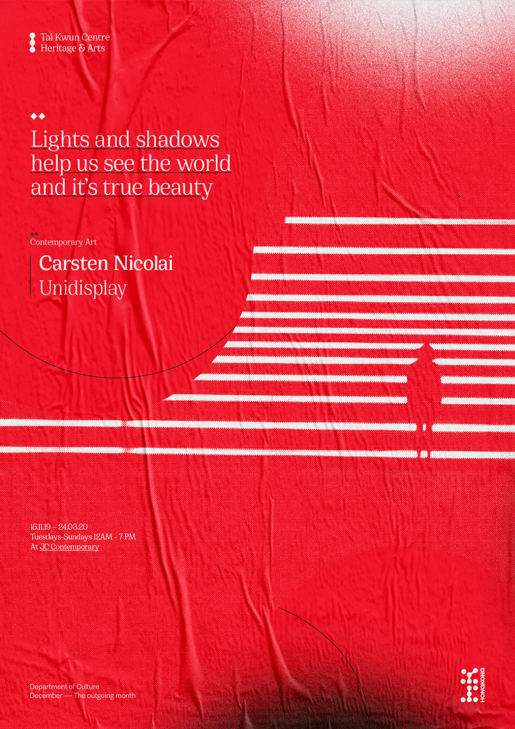
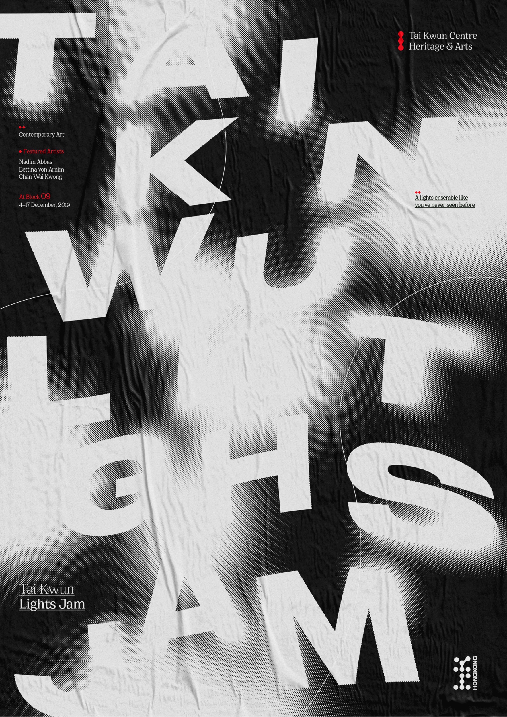
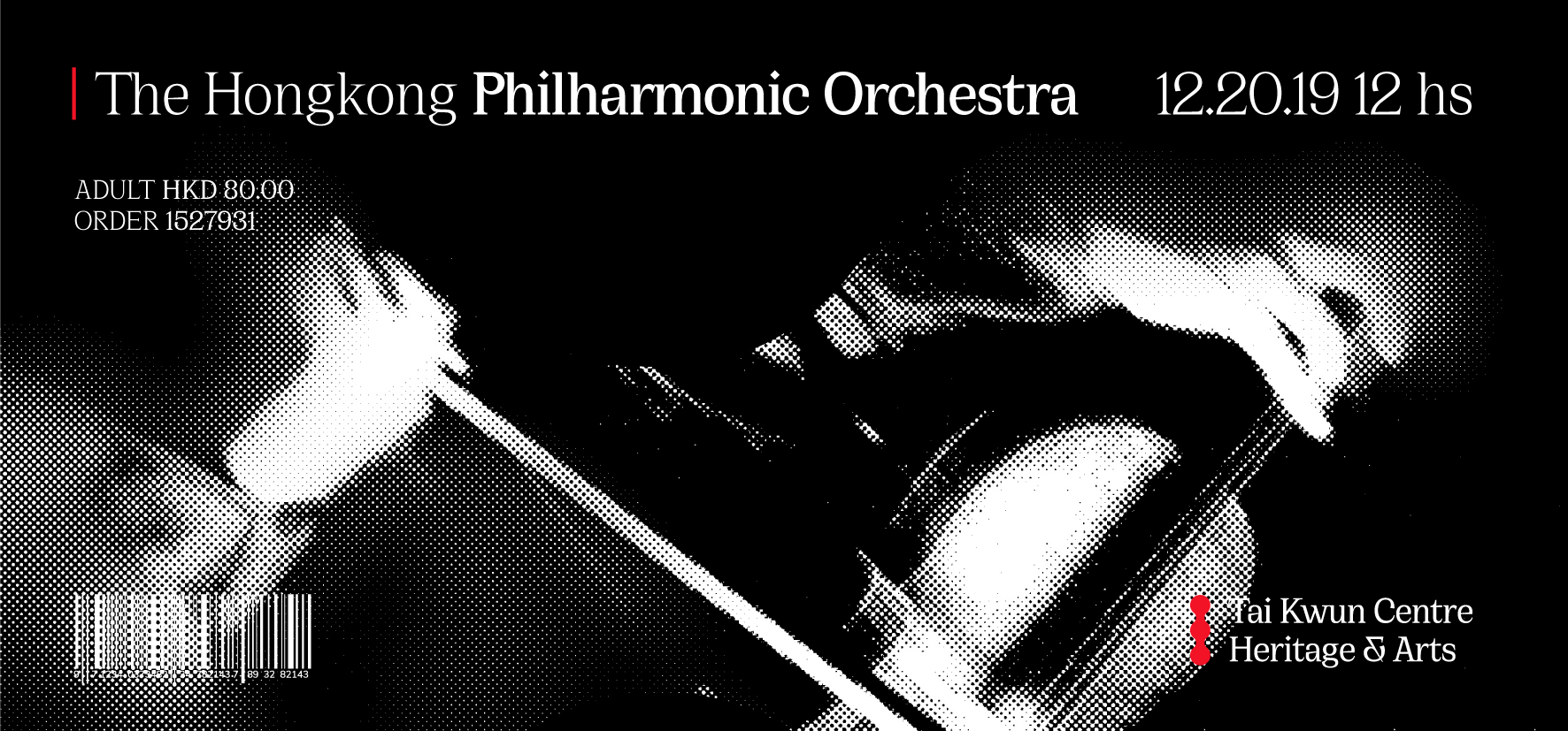
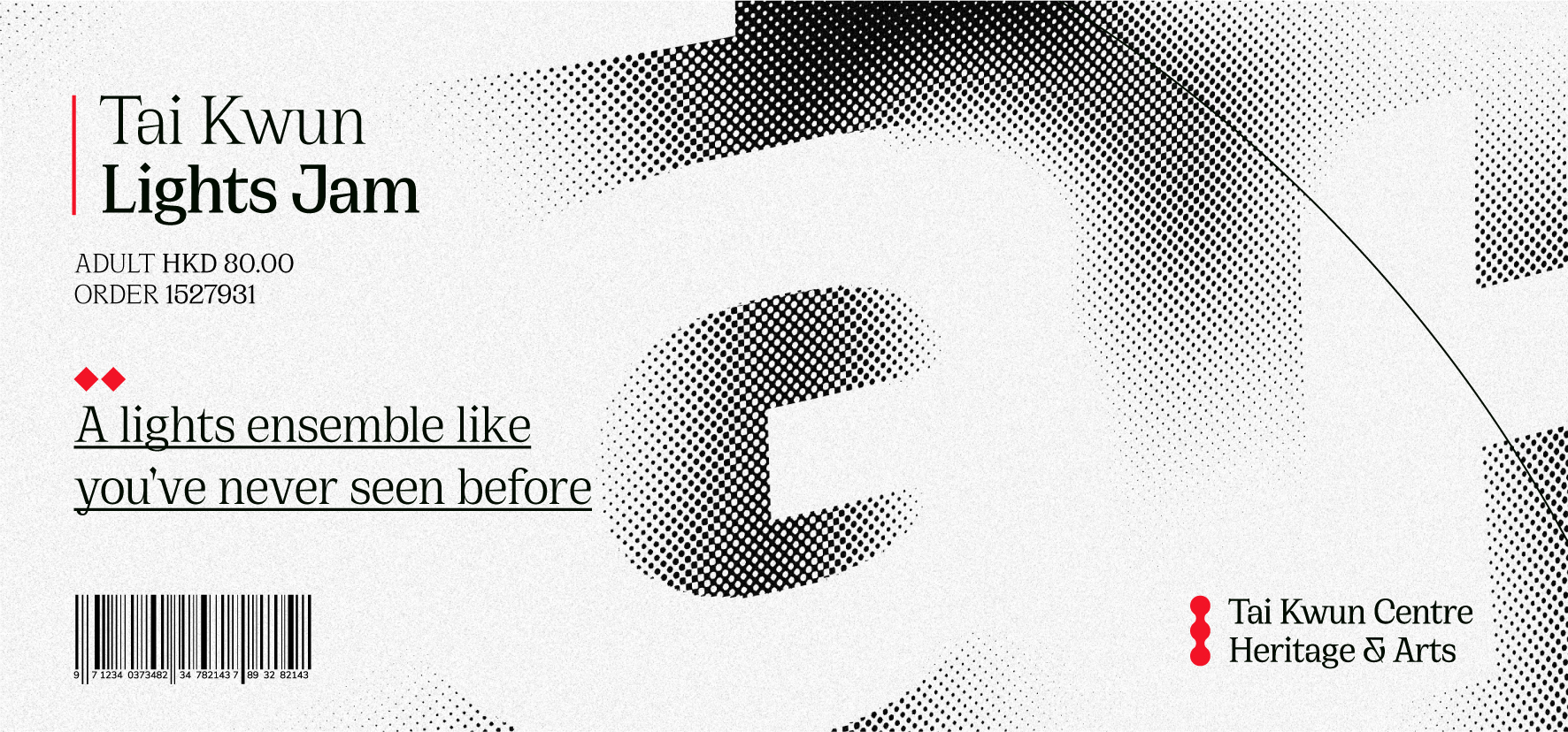
Lastly, a refresh of one of Hongkong’s most valued Cultural space’s branding was developed, including an events schedule brochure and three main posters


Credits
Strategy Diego Holzman
Concepting Diego Holzman
Design Diego Holzman
University Thesis, University of Buenos Aires.
November 2019.
Concepting Diego Holzman
Design Diego Holzman
University Thesis, University of Buenos Aires.
November 2019.